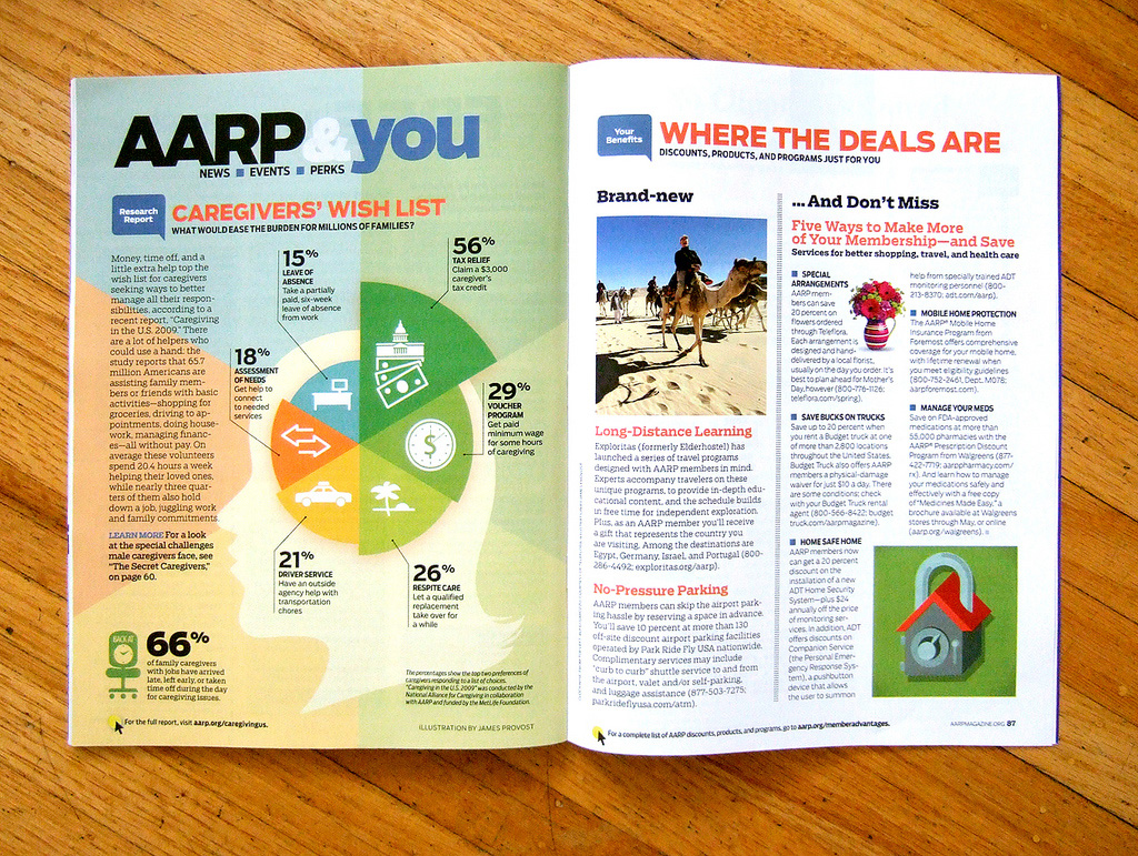
Earlier in the year, I worked with the world’s largest circulation magazine, AARP The Magazine, which focuses on aging issues. AD Joanna Foucheux had some survey data about caregivers’ preferences for different types of government support, and wanted to communicate that data visually.Caregivers were given a list of possible government support options and were asked their top two preferences. I was asked to illustrate the six most popular options. I chose a polar area pie chart to do this, and set to work on icons to represent the different programs and to give the data some context.
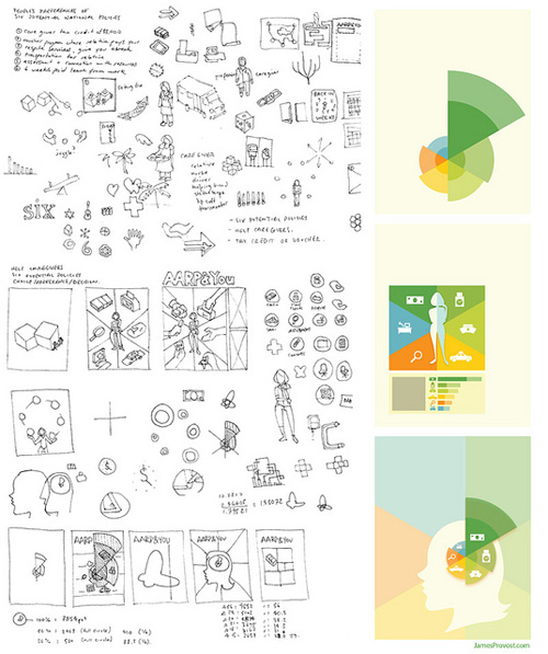
In the end, an editorial decision was made to show only the combined first- and second-most popular options, which simplified the chart a bit. Here’s how it turned out:

Update: This work has moved to my editorial illustration portfolio, Textbook Example.