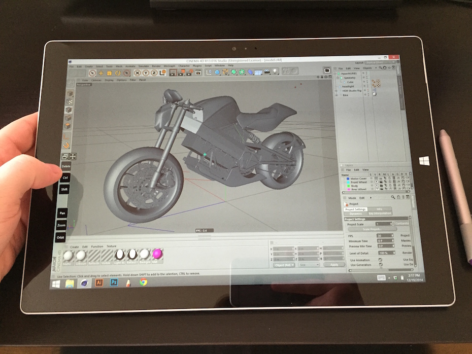
For about two months, I’ve been experimenting with a Microsoft Surface Pro 3, to see if it could be the all-in-one mobile illustration studio that the marketing has made it out to be. Here is what I’ve learned.
Criteria
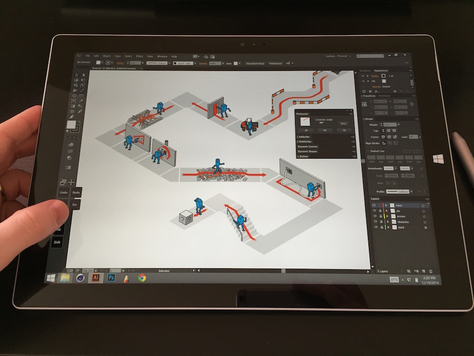
For my work, I mostly use Illustrator, Photoshop, Cinema 4D, After Effects and Sketchbook Pro with a Wacom Intuos 5 Medium on a Mac Pro with twin 24″ displays. What I’m looking for is something I can take with me when I’m away from the studio, in case a client needs a quick edit, comp, revision or render.
Since I do some 3D and video work, and I love having extra horsepower, I went for the top-tier Intel i7 processor. I decided not to get the Smart Cover, as other artists have mentioned that it just gets in the way when drawing with the pen. If I’m happy with the Surface, I might get a mini bluetooth keyboard or a gaming pad like the Razer Nostromo for hotkeys, and position it however it’s comfortable.
The Good
Overall, I’m really impressed by the SP3. The build quality is great and the design feels well considered. The screen is bright and crisp. The kickstand allows me to find the perfect angle for drawing, browsing or reading. The modern tile interface of Windows 8 is inviting (although not nearly as intuitive as an iPad) and the classic Desktop interface is just a tap away. The device was responsive, programs and files opened and ran briskly. All in all, the SP3 feels like a mature but still evolving product.
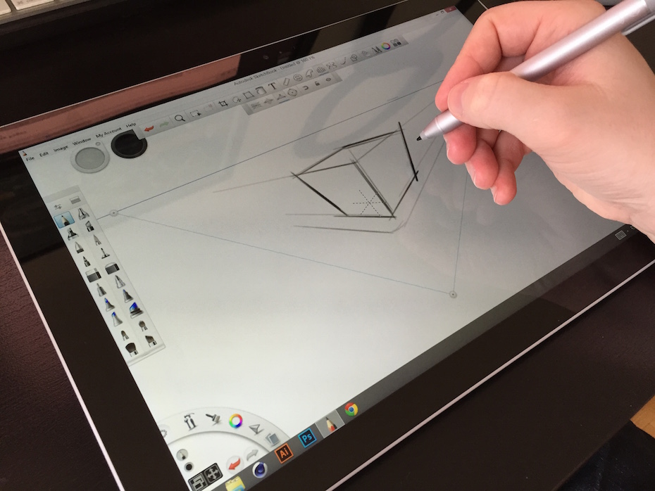
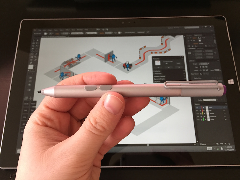
The pen tracks accurately and has a good tip feel. The Surface felt like a good size and aspect ratio for drawing, pretty similar dimensions to my Intuos. The pen customization options are limited compared to a Wacom product (only about six pre-defined pressure curve profiles) but I was able to find something that felt good. That’s about where the good things I have to say about the pen end.
What became immediately apparent when I tried to work on the Surface was how much I rely on modifier keys (holding down Shift, Alt, Ctrl, Space, etc. while clicking, dragging and so on). They’re pretty much essential in all the production programs I use, and even in how I browse or use an OS. Without a keyboard, the SP3 was a non-starter. Luckily, via SurfaceProArtist I found RadialMenu, a program that adds customizable, application-specific hotkey docks anywhere on your screen, as well as a namesake ring menu around your pen cursor. It’s not the most polished or stable program, but it’s absolutely indispensable when using the Surface without a keyboard.


The Bad
The biggest weakness of the SP3 for me is the pen. Previous versions of the Surface used pen technology and, more importantly, drivers by Wacom, but the SP3 does not. While Wacom pens are powered by magic, the SP3 pen is powered by not one, but three batteries, one in the barrel and two button-cells in the top. The batteries add a nice weight to the pen, but rattle slightly with every movement. The barrel is matte aluminum and feels kind of cheap and fragile in the hand and unbalanced with the batteries.
As mentioned before, the pen driver is lacking in customization options. The two side buttons are not configurable. The purple top button can only open One Note, though I never got this working despite pairing, un-pairing, re-booting, re-pairing, removing batteries and replacing batteries, ad nauseum (yes, that one button is a separate Bluetooth device).

Windows 8 was a new experience for me. I’ve been using Macs for about 12 years, but I want to say I went into it with an open mind. I find the modern tile interface appealing, but in practice I ended up turning off all the live tiles that flash news, feeds, updates and pictures, because they just distract me from what I sat down to do. At first, I thought Microsoft had done a good job of simplifying the PC experience, but it didn’t take long to realize that they’ve mostly hidden the complexity away.
The Desktop environment doesn’t seem like it has changed in the dozen years I’ve been away. It’s tricky to navigate without the pen or a mouse, but I guess the modern interface is more intended for touch input. Windows 8 would really be improved with multitouch gesture support, especially if it were customizable. I use BetterTouchTool on all my Macs, and the terribly-named TouchMe Gesture Studio got me close to that level of control.
The SP3 runs hot. I first noticed it while working in Cinema 4D, but soon I realized it was hot whether I was watching a video, browsing the web or reading a magazine. It seems like the processor is positioned in the lower right (if you’re looking at the SP3 in landscape with the Windows button on the righthand side) and it becomes uncomfortably warm when you rest your hand there while drawing. From other reports online, it sounds like the i7 suffers from this problem the worst, but all models tend to get warm to the touch.
The Ugly
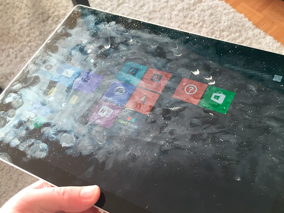
Fresh out of the box, the screen on the Surface Pro 3 is shiny, crisp and black. After only a day’s use, it looks like this:

Sure, this happens to iPads and every other tablet, but not as quickly or as severely. I don’t know what magical oleophobic coating Apple uses on their products, but the SP3 needs some of that, lickity split.
The Windows “button” on the front of the Surface is actually more of a touch or proximity sensor, which means if you’re right handed and drawing on the SP3, you’re going to hit it by accident. Constantly. The button takes you out of your program back to the Start Screen shown above. Microsoft has created a way to disable this button, but it doesn’t disable the haptic vibration motor that buzzes every time you brush past the button. Maddening!
I love magazines, so naturally I’m a big fan of Next Issue. I was happy to find out they have an app in the Windows Store. Unfortunately, I found that the video and interactive components in many of the magazines did not run properly on the Windows version. This is obviously no fault with the Surface, and out of the control of Microsoft, but it’s a reminder that Windows is no longer the priority platform for developers and startups.
Conclusion
In the end, I returned my Surface to the store. I really wanted to like it, but the pen was a real deal-breaker for me. My wishlist for the Surface 4 is short: Better pen drivers, third party pens, and better heat dispersion.
I might pick up a Wacom Companion in the new year to see how it compares.
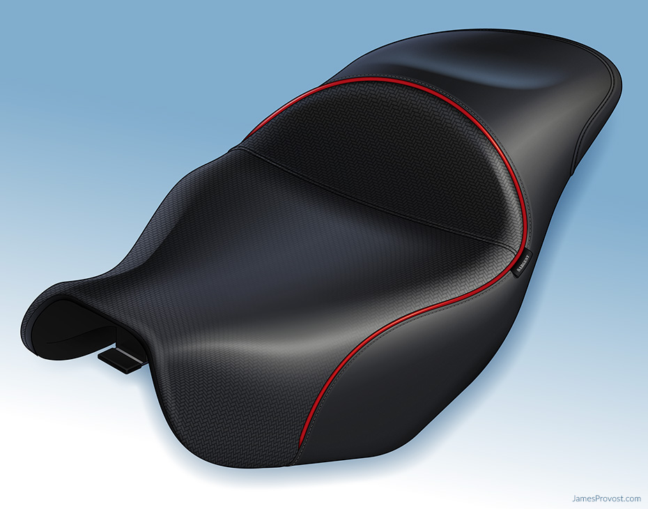 A few months ago, I was approached by Sargent Cycle Products with a problem.
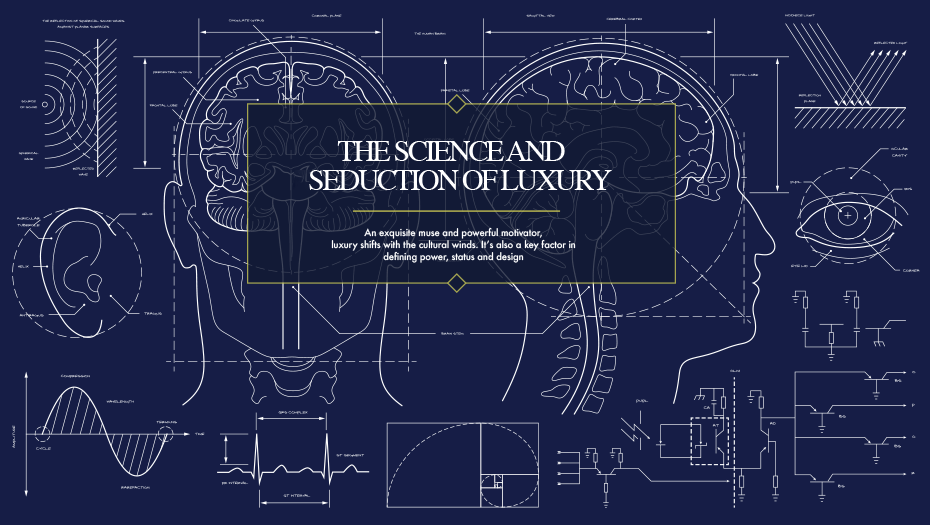 I worked with The New York Times’ in-house marketing team, T Brand Studio, on a special section called
 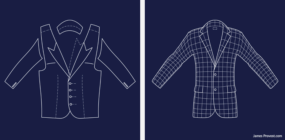 The project explores the interplay of old and new, heritage and innovation, status and luxury. The blueprint style illustrations lend a feeling of scientific, analytical comparison between the eras.